
Genetic Trait Reports
Case StudyRole: Lead Designer
Genetic trait reports help users understand how their DNA influences their physical traits. Trait Reports can be a tricky experience to manage: results at odds with a user’s phenotypic characteristics can quickly erode confidence in the entire DNA product, while results that simply confirm what a user already knows is underwhelming and erodes value.
I spearheaded an effort to introduce interactivity and community insights to help user better understand and engage with the report, no matter the results.
I spearheaded an effort to introduce interactivity and community insights to help user better understand and engage with the report, no matter the results.
Background
We’d released a handful of trait reports to a limited beta in the UK with some boilerplate content, built off of our more developed carrier and health reports. Our product owner had identified some initial problems that we hoped to address before a general release in the US.Principal Problems:
-
Reports were showing low enagement
- A vocal minority of users wanted more technical information
- Most users were underwhelmed or bored
- Needed to identify areas of interest for future report development
Constraints:
- Technical data was the only real content we had on hand
- Solution needed to be modular, and support all report types (traits, conditions, carrier status)
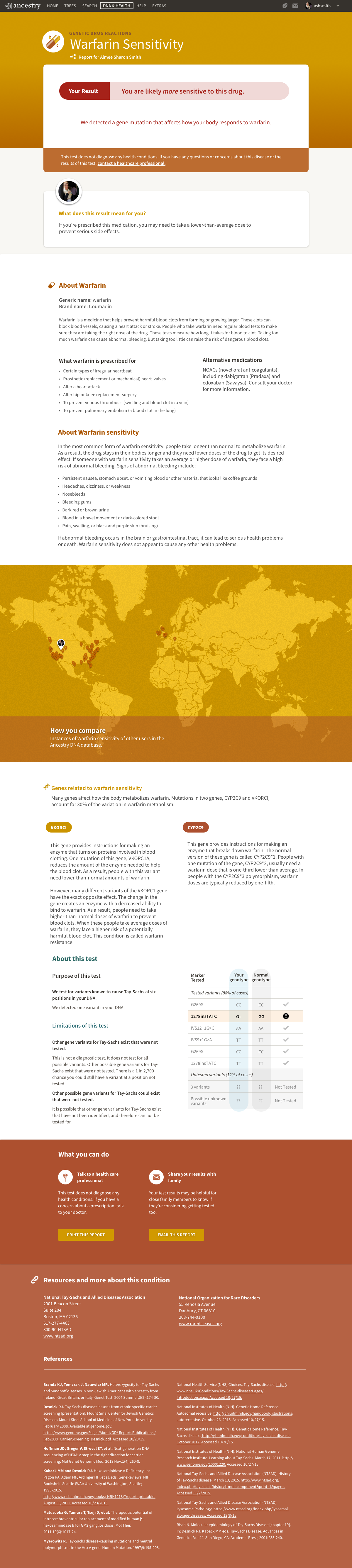
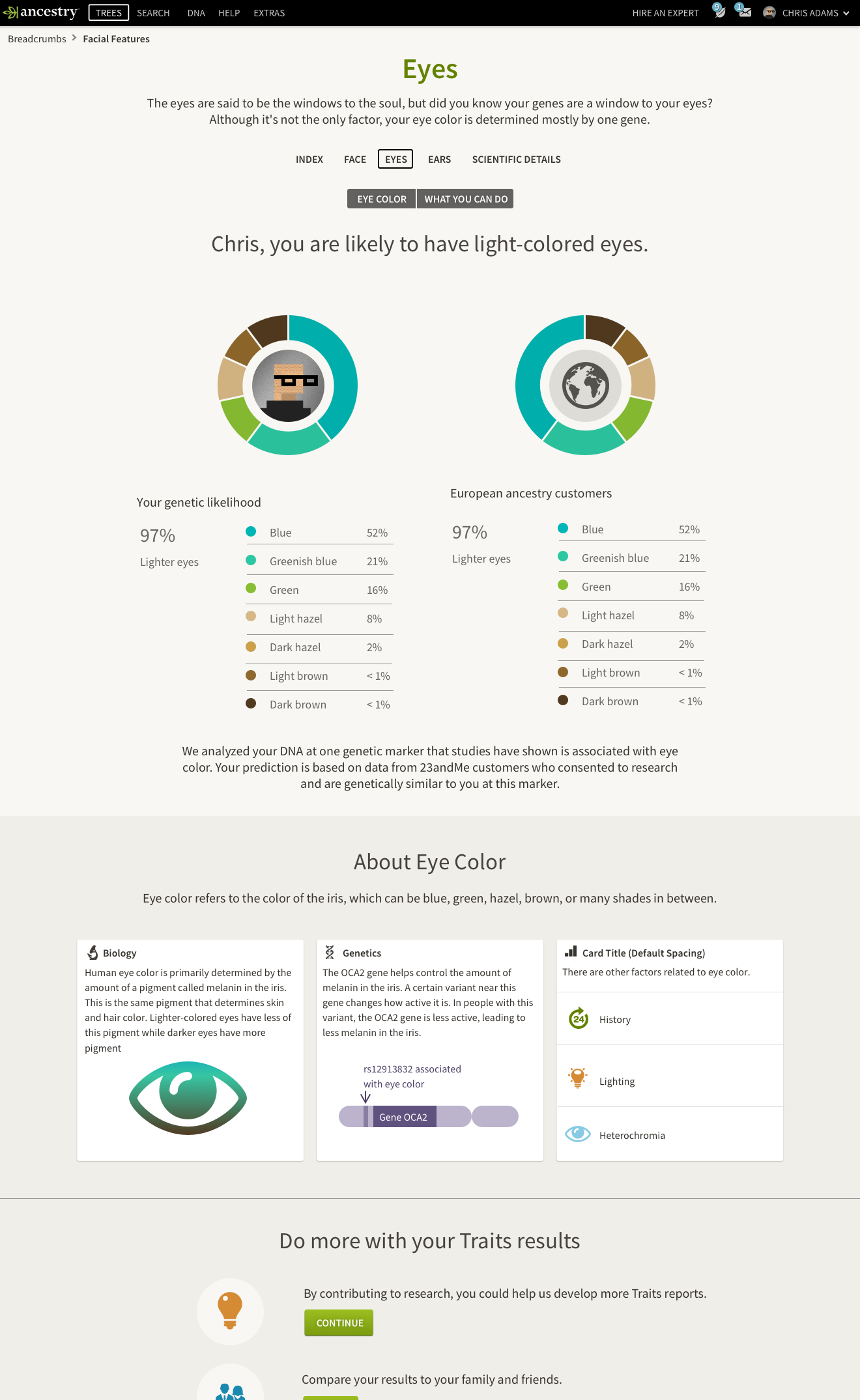
Old Report Designs:
(These are doozies)


User Testing & Research
Methods
- Post-results user interviews: We gathered users to conduct discovery sessions by working with customer support to identify users who’d submitted tickets because their results were “wrong,” and by intercepting users via Intercom while on their results.
- Pre-result user observation: We created a survey to be displayed after kit-purchase and in kit-ship confirmation emails to collect users willing to open their results under product tiger-team observation.
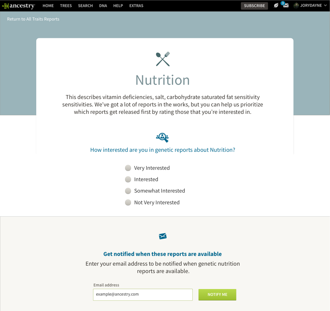
- Painted Door Testing: Created several upsell opportunities post purchase to assess interest in different trait types to direct next stage of investment, measured click through and form results.


We sought sentiment around expecations, discussed reactions, and helped explain results. We dove deep on what users expected to be able to do with their results, who they would share results with, and their interest in traits in general.
Findings
-
Users felt the reports were sterile, too dry, and explanations overly “text-booky”
-
Users expected an extreme degree of accuracy from Genetic Science
-
Users did not understand the difference between genotypic and phenotypic characteristics
- Users mainly wanted to explore and compare their results to others
- Users wanted to see any- and everything we could show them.
Recommendations
- Overhaul copy and visuals to create a modern, informal-but-informative report
- Anchor the page around interactivity, utilize our survey service & reusable data viz
- Provide contextual comparison to help users better investigate their results
- Decouple Traits from other Health products, move to core DNA experience
UI & UX
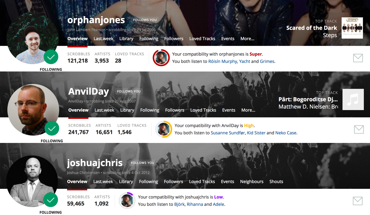
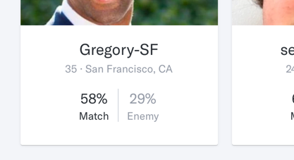
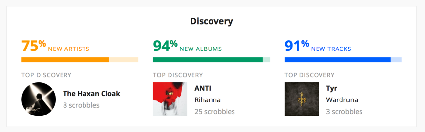
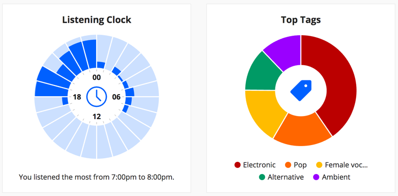
I suggested we stop looking at other medical or health products and start looking at more accessible social products to inform our approach: we looked at products like LastFM’s listener habits data visualizations, and OkCupid’s match metrics.

Copy
At the same time, my product manager and I began identifying consumer experiences that were running into our same problems copy-wise, and felt had handled them well: banking and investing services. We looked for copy that had taken dry, technical information and made it approachable and easily understood. I worked with my product manager to workshop copy, and then built a repository and reference guide for our UX writer to polish and templatize.

Proposed Document Structure

Final Experiences

Abbreviated technical report that jumps you to the full report if requested.
Inserted Featured Survey to gather phenotypic results while education user.


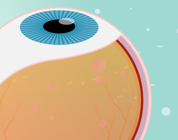
Bold, simple “pop science” illustrations to punctuate, and break-up content into digestible tidbits.
Before & After

Interactive Prototype
UI Mixplate
Look: interface ages like milk, but here’s some context-free eye-candy to prove that I know my way around Figma, Illustrator, et al.


︎︎︎︎︎︎︎︎︎︎︎︎︎
Bio
I’ve designed products and managed brands for billion dollar corporations and public institutions alike. While I’ve worked in many fields (editorial, brand, art direction, photo & video production) I have specialized experience in developing and shipping multi-platform digital products
Read More ︎
Contact
︎ hi@joryhemmelgarn.com
︎ 801-735-7697
Here are some keywords of “stuff I’m very good at” for SEO bots and recruiters-on-the-go:
User Research, Product Design, UI Design, Figma, Icon Design, Design Systems, Interface Design, Inclusive Design, Accessibility, A11y, Artificial Intelligence, Large Language Models, Machine Learning, Natural Language Processing, Mobile First Design, Metric Driven Design, Prototyping, Ontological Models, Designing for Deep Data, Adobe Creative Suite, Process Design, Service Design, Collaboration ︎
All content © 2008-2024 Jory Hemmelgarn